Lab 01: Nathan’s Hot-Dog Eating Contest
BMI 5/625
Alison Hill (with minor modifications by Steven Bedrick)
1 Goals for Lab 01
- Get your feet wet!
- Innoculate you against
ggplot2errors- we all get them! - Get exposed to the range of things you can do, before we go deep…
- Develop your own personal preferences for
data visualizations!
- Do you like or hate gridlines?
- What fonts do you find pleasant to read?
- What kinds of colors do you like?
- Are you team
theme_grayortheme_bw(ortheme_minimal)?
These are important questions, and I want you to develop
(well-informed) opinions on these matters! 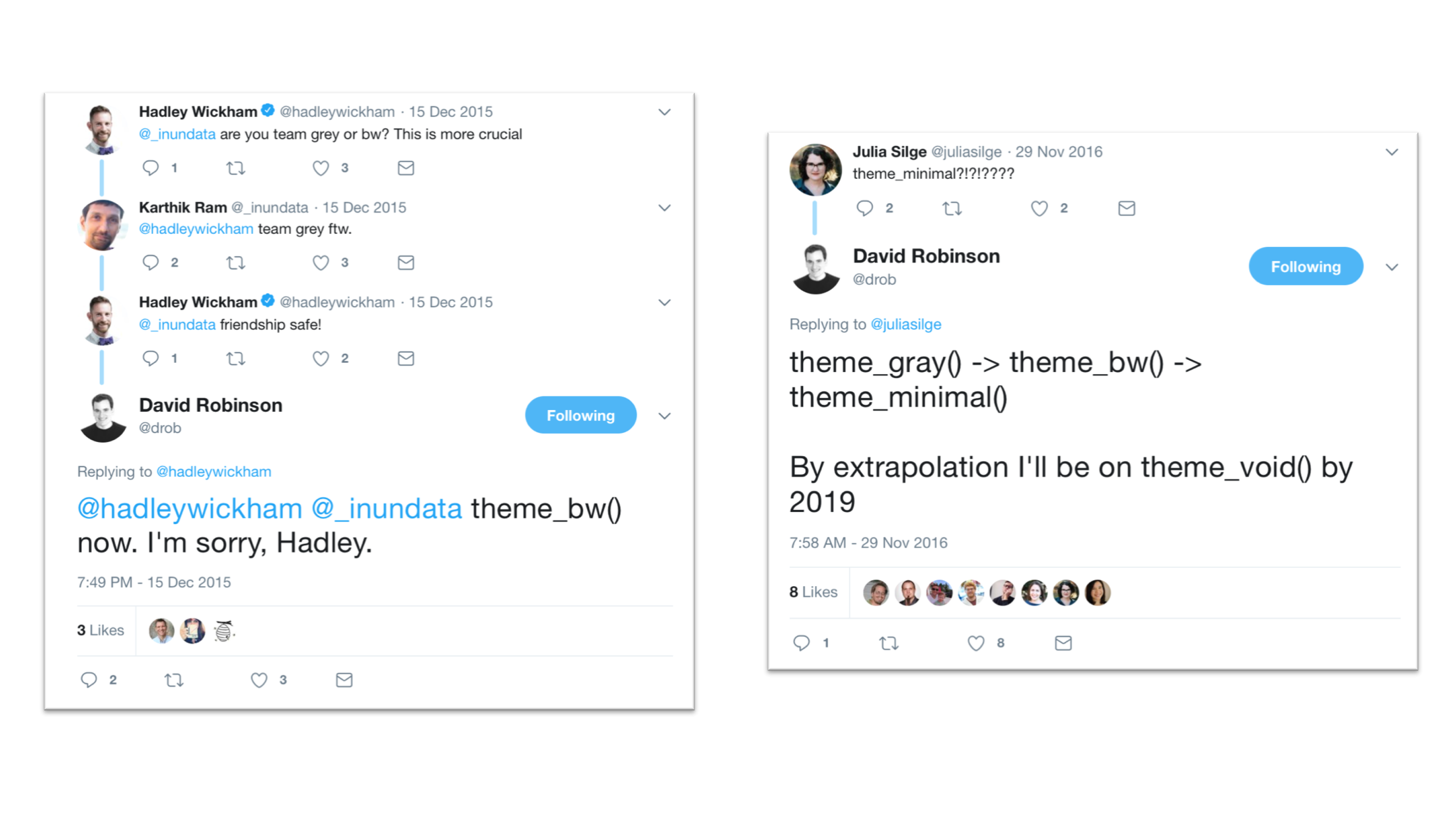
Most of the things we cover today, we will be re-visiting later in the term; you are not expected to be familiar with all of the R functions or patterns that we are using.
Other things to think about for this lab:
- Try not to copy-and-paste code:
- Becoming efficient/proficient with R depends on building muscle memory, and the only way to do that is to type
- By typing, you will introduce errors, and this is a good chance to get practice at interpreting and fixing them.
- Take note of steps or functions that involve bits of R that you are unfamiliar with- this lab will help you identify particular areas that you are comfortable with as well as areas you will want to focus on.
2 Nathan’s Hot Dog Eating Contest

This includes a reconstruction of Nathan
Yau’s hot dog contest example, as interpreted by Jackie Wirz, ported
into R and ggplot2 by Steven Bedrick for a workshop for the
OHSU Data
Science Institute, and finally adapted, made idiomatic, and improved
by Alison Hill for all you intrepid Data-Viz-onauts!
First, we load our packages:
library(tidyverse)
library(extrafont)
library(here)
3 Read in and wrangle data
Next, we load some data. In the Posit Cloud project for this lab, you
will see a data directory with the necessary files. We can
read it in using read_csv, and along the way use
col_factor to tell it how to handle the gender column.
hot_dogs <- read_csv(here::here("data", "hot_dog_contest.csv"),
    col_types = cols(
      gender = col_factor(levels = NULL)
    ))
3.1 Validation
Check it out, once it is read in, and make sure it looks like this!
glimpse(hot_dogs)Rows: 63
Columns: 4
$ year <dbl> 2024, 2024, 2023, 2023, 2022, 2022, 2021, 2021, 2020, 2020, …
$ gender <fct> male, female, male, female, male, female, male, female, male…
$ name <chr> "Patrick Bertoletti", "Miki Sudo", "Joey Chestnut", "Miki Su…
$ num_eaten <dbl> 58.00, 51.00, 62.00, 39.50, 63.00, 40.00, 76.00, 30.75, 75.0…hot_dogs# A tibble: 63 × 4
year gender name num_eaten
<dbl> <fct> <chr> <dbl>
1 2024 male Patrick Bertoletti 58
2 2024 female Miki Sudo 51
3 2023 male Joey Chestnut 62
4 2023 female Miki Sudo 39.5
5 2022 male Joey Chestnut 63
6 2022 female Miki Sudo 40
7 2021 male Joey Chestnut 76
8 2021 female Michelle Lesco 30.8
9 2020 male Joey Chestnut 75
10 2020 female Miki Sudo 48.5
# ℹ 53 more rowsAt this point, follow the HLO process and familiarize yourself with the columns and their contents. Questions to ask:
- Are the types of the columns what you would expect? Note that this requires that you have some notion of what to expect! Possible things to think about:
- What type makes sense for a column representing a year?
- What about the
num_eatencolumn? - What about the
gendercolumn? What assumptions - What are the minimum and maximum values in the numeric columns? Are the values in the range you would expect?
- Are there any missing values?
In addition to glimpse(), try loading (not installing)
the skimr package and using its skim()
function on the hot_dogs data frame.
3.2 Adding a variable
In addition to the information that is already in the
dataset itself, we know that we will also be wanting to somehow include
information about whether a given year was before or after the
incorporation of the competitive eating league. Let’s add an
indicator variable to the data using mutate().
Also, the data’s a little sketchy pre-1981, and for our purposes today
we’ll be focusing on males only, so let’s do some
filtering, as well:
hot_dogs <- hot_dogs %>%
  mutate(post_ifoce = year >= 1997) %>%
  filter(year >= 1981 & gender == 'male')
hot_dogs
# A tibble: 44 × 5
year gender name num_eaten post_ifoce
<dbl> <fct> <chr> <dbl> <lgl>
1 2024 male Patrick Bertoletti 58 TRUE
2 2023 male Joey Chestnut 62 TRUE
3 2022 male Joey Chestnut 63 TRUE
4 2021 male Joey Chestnut 76 TRUE
5 2020 male Joey Chestnut 75 TRUE
6 2019 male Joey Chestnut 71 TRUE
7 2018 male Joey Chestnut 74 TRUE
8 2017 male Joey Chestnut 72 TRUE
9 2016 male Joey Chestnut 70 TRUE
10 2015 male Matthew Stonie 62 TRUE
# ℹ 34 more rows4 Plot The Data
Now let’s try making a first crack at a plot:
ggplot(hot_dogs, aes(x = year, y = num_eaten)) +
  geom_col()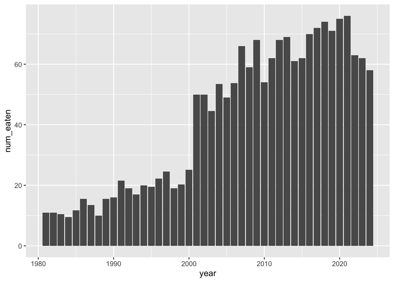
Note that our data is already in “counted” form, so we’re using
geom_col() instead of geom_bar().
We will now progressively improve this visualization, one step at a time.
5 Add Axis Labels And Title
ggplot(hot_dogs, aes(x = year, y = num_eaten)) +
  geom_col() +
  labs(x = "Year", y = "Hot Dogs and Buns Consumed") +
  ggtitle("Nathan's Hot Dog Eating Contest Results, 1981-2024", subtitle = "(Male contestants only)")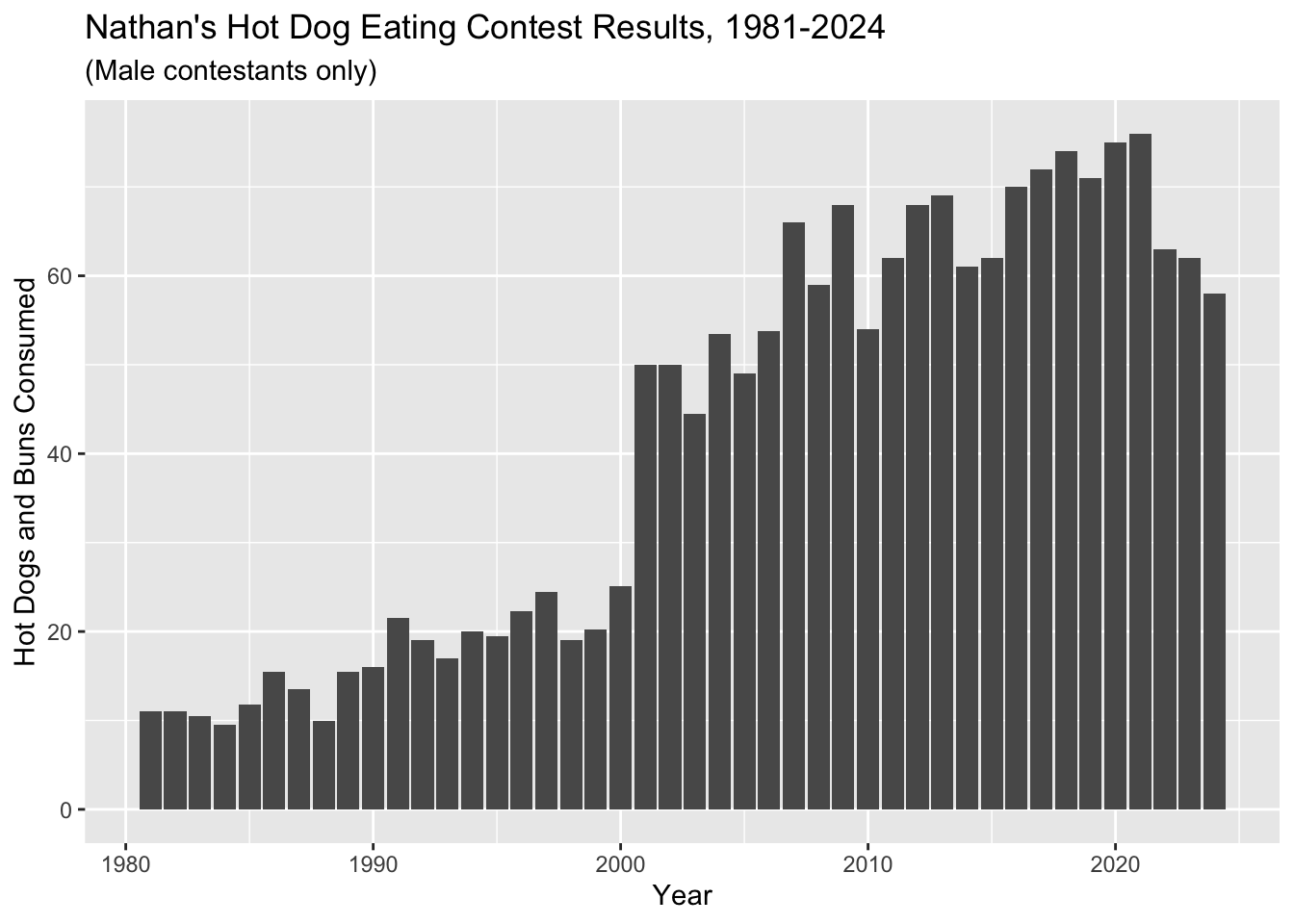
6 Play With Colors
Make 3 versions of the last plot we just made:
- In the first, make all the columns outlined in “white”.
- In the second, make all the columns outlined in “white” and filled in “navyblue”.
- In the third, make all the columns outlined in
“white” and filled in according to whether or not
post_ifoceis TRUE or FALSE (use default colors for now).
HINT: color and fill are two of
ggplot’s aesthetic mapping variables (i.e., “things about
how the plot looks that we get to specify”)
ggplot(hot_dogs, aes(x = year, y = num_eaten)) +
  geom_col(colour = "white") +
  labs(x = "Year", y = "Hot Dogs and Buns Consumed") +
  ggtitle("Nathan's Hot Dog Eating Contest Results, 1981-2024", subtitle = "(Male contestants only)")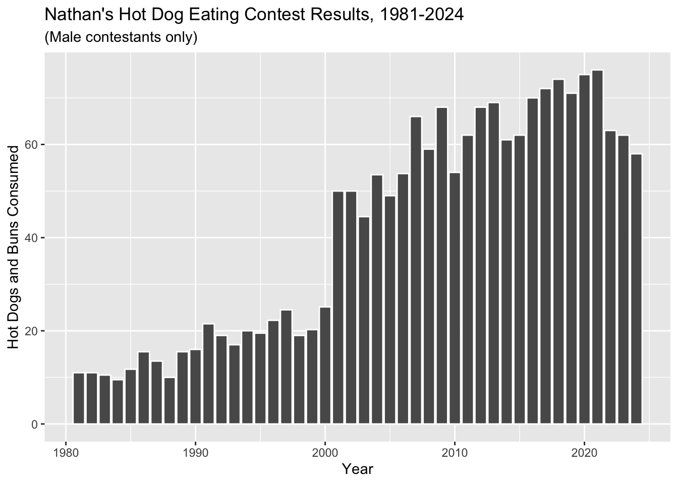
ggplot(hot_dogs, aes(x = year, y = num_eaten)) +
  geom_col(colour = "white", fill = "navyblue") +
  labs(x = "Year", y = "Hot Dogs and Buns Consumed") +
  ggtitle("Nathan's Hot Dog Eating Contest Results, 1981-2024", subtitle = "(Male contestants only)")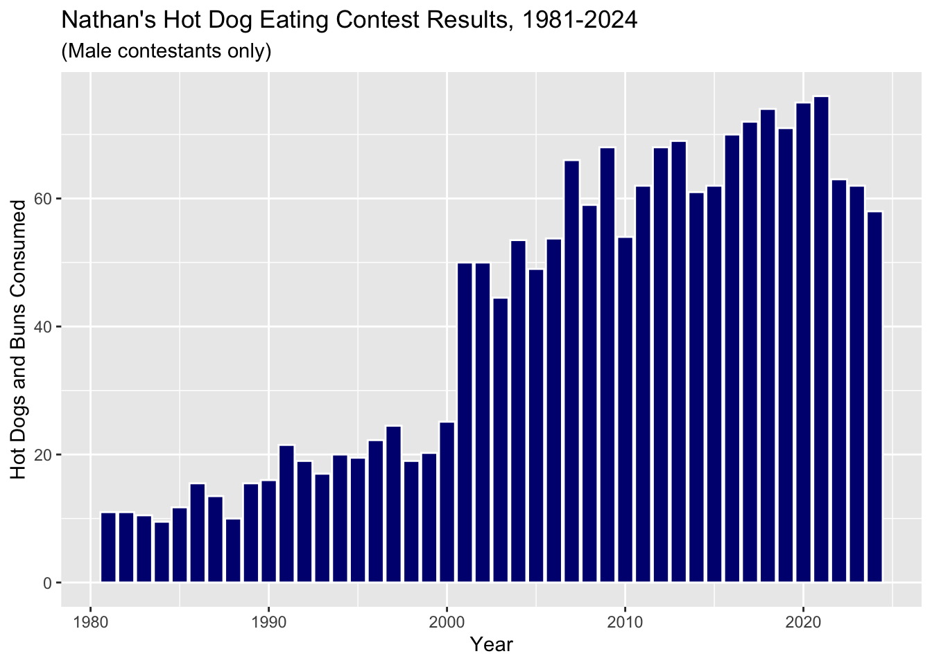
ggplot(hot_dogs, aes(x = year, y = num_eaten)) +
  geom_col(aes(fill = post_ifoce), colour = "white") +
  labs(x = "Year", y = "Hot Dogs and Buns Consumed") +
  ggtitle("Nathan's Hot Dog Eating Contest Results, 1981-2024", subtitle = "(Male contestants only)")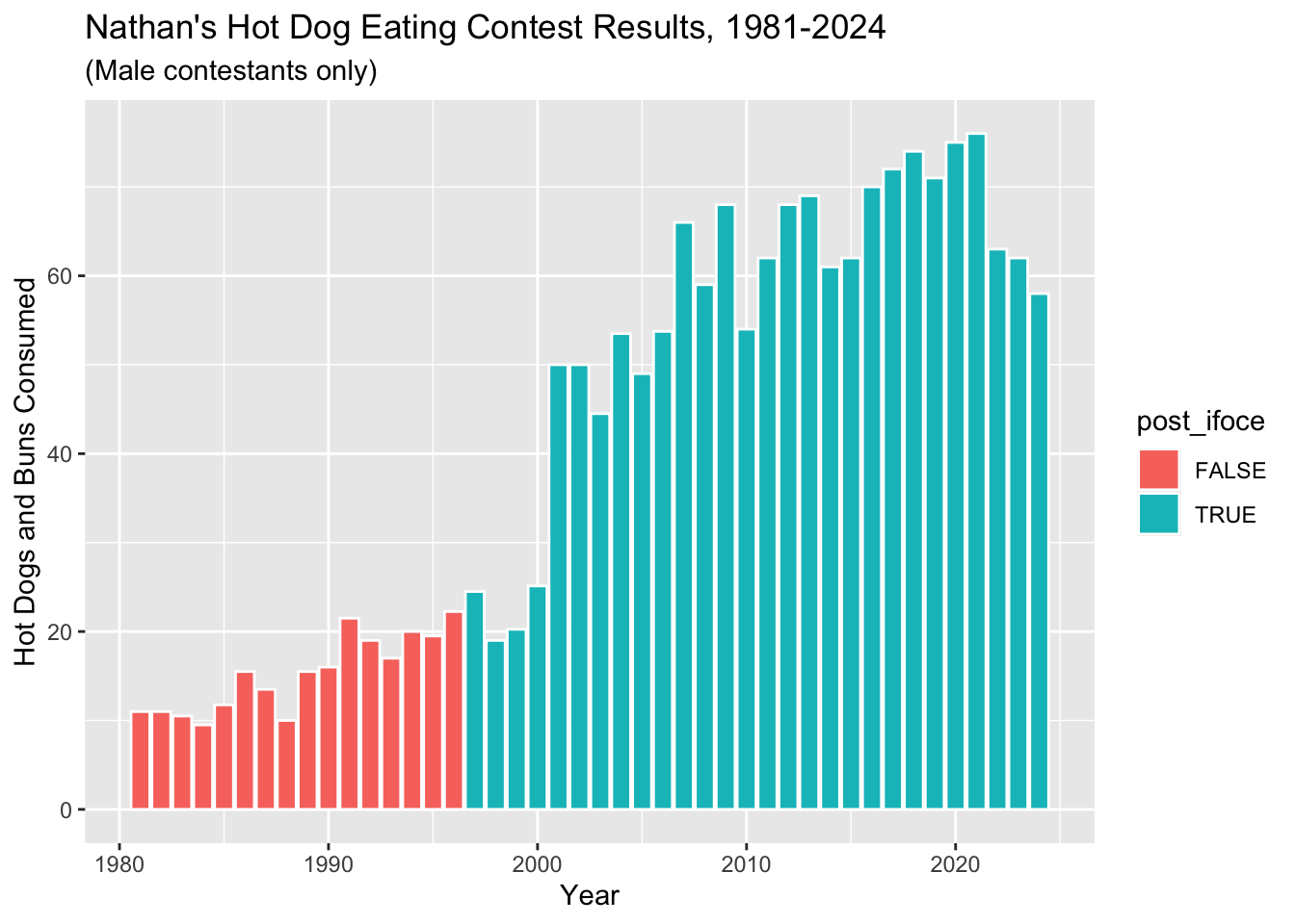
What if you want to change the legend in the last plot you made? Use google to figure out how to do the following:
- Delete the legend title
- Make the legend text either “Post-IFOCE” or “Pre-IFOCE”.
HINT: in ggplot, legends are controlled by the relevant
scale (color, fill, etc.) that they are mapped to.
ggplot(hot_dogs, aes(x = year, y = num_eaten)) +
  geom_col(aes(fill = post_ifoce), colour = "white") +
  labs(x = "Year", y = "Hot Dogs and Buns Consumed") +
  ggtitle("Nathan's Hot Dog Eating Contest Results, 1981-2024", subtitle = "(Male contestants only)") +
  scale_fill_discrete(name = "",
                      labels=c("Pre-IFOCE", "Post-IFOCE"))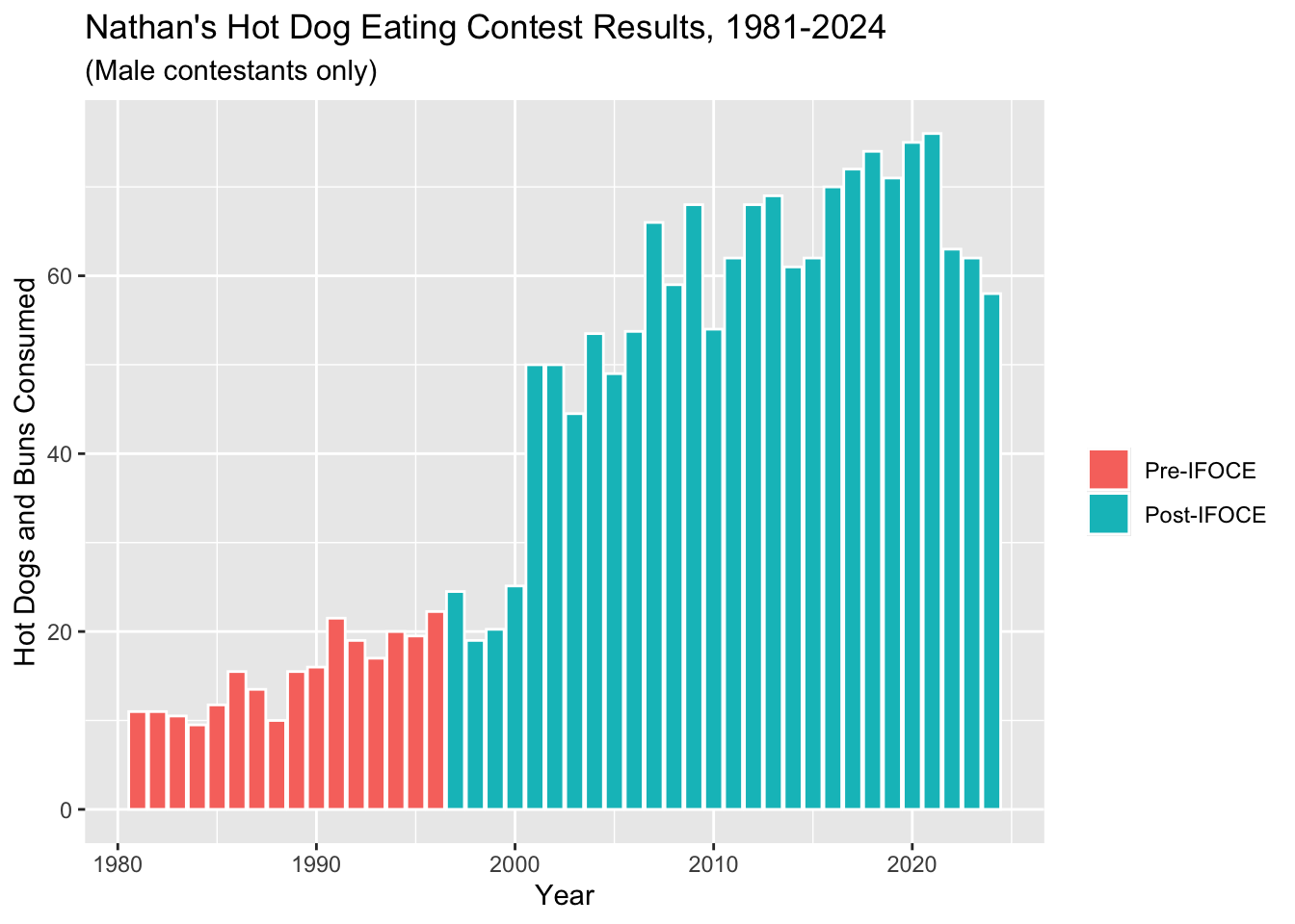
7 Change The Dataset
Now, let’s change the question a little bit. Up to this point, we have looked at HDB performance relative to the creation of the IFOCE. What if what matters is the affiliation of the contestants (i.e., whether or not the contestants are members of the IFOCE or not)? We’ll need some different data for this. Through the Magic Of Data Science™, we have dug that information up and put it into an expanded version of our CSV file, which you can find in the data directory.
Let’s work with this new dataset! Do the following:
Read in the “hot_dog_contest_with_affiliation.csv” data file, using
col_typesto read inaffiliatedandgenderas factors.Within a
mutate, create a new variable calledpost_ifocethat is TRUE ifyearis greater than or equal to 1997.Also
filterthe new data for only years 1981 and after, and only for male competitors.
hdm_affil <- read_csv(here::here("data", "hot_dog_contest_with_affiliation.csv"),
    col_types = cols(
      affiliated = col_factor(levels = NULL),
      gender = col_factor(levels = NULL)
      )) %>%
  mutate(post_ifoce = year >= 1997) %>%
  filter(year >= 1981 & gender == "male")
hdm_affil <- read_csv(here::here("data", "hot_dog_contest_with_affiliation.csv"),
col_types = cols(
affiliated = col_factor(levels = NULL),
gender = col_factor(levels = NULL)
)) %>%
mutate(post_ifoce = year >= 1997) %>%
filter(year >= 1981 & gender == "male")
glimpse(hdm_affil)Rows: 44
Columns: 6
$ year <dbl> 2024, 2023, 2022, 2021, 2020, 2019, 2018, 2017, 2016, 2015,…
$ gender <fct> male, male, male, male, male, male, male, male, male, male,…
$ name <chr> "Patrick Bertoletti", "Joey Chestnut", "Joey Chestnut", "Jo…
$ num_eaten <dbl> 58.000, 62.000, 63.000, 76.000, 75.000, 71.000, 74.000, 72.…
$ affiliated <fct> current, current, current, current, current, current, curre…
$ post_ifoce <lgl> TRUE, TRUE, TRUE, TRUE, TRUE, TRUE, TRUE, TRUE, TRUE, TRUE,…Let’s do some basic EDA with this new dataset! Do the following:
Use
dplyr::distinctto figure out how many unique values there are ofaffiliated.Use
dplyr::countto count the number of rows for each unique value ofaffiliated; use?countto figure out how to sort the counts in descending order.
hdm_affil %>%
  distinct(affiliated)
# A tibble: 3 × 1
affiliated
<fct>
1 current
2 former
3 not affiliatedhdm_affil %>%
count(affiliated, sort = TRUE)# A tibble: 3 × 2
affiliated n
<fct> <int>
1 not affiliated 20
2 current 18
3 former 6Now let’s plot this new data, and fill the columns according to our
new affiliated column.
ggplot(hdm_affil, aes(x = year, y = num_eaten)) +
  geom_col(aes(fill = affiliated)) +
  labs(x = "Year", y = "Hot Dogs and Buns Consumed") +
  ggtitle("Nathan's Hot Dog Eating Contest Results, 1981-2024", subtitle = "(Male contestants only)")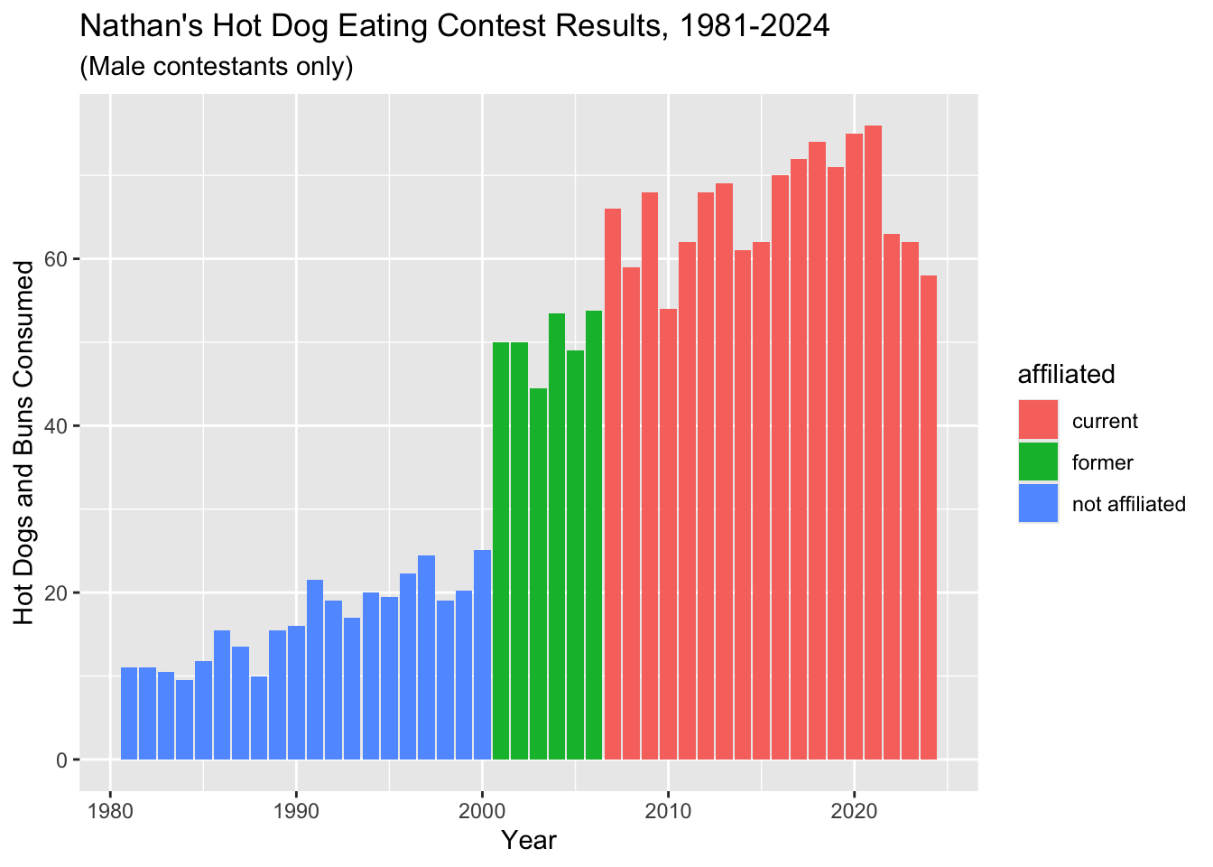
Do the following updates to the last plot we just made:
Update the colors using hex colors:
c('#E9602B','#2277A0','#CCB683').Change the legend title to “IFOCE-affiliation”.
Save this plot object as “affil_plot”.
affil_plot <- ggplot(hdm_affil, aes(x = year, y = num_eaten)) +
  geom_col(aes(fill = affiliated)) +
  labs(x = "Year", y = "Hot Dogs and Buns Consumed") +
  ggtitle("Nathan's Hot Dog Eating Contest Results, 1981-2024", subtitle = "(Male contestants only)") +
  scale_fill_manual(values = c('#E9602B','#2277A0','#CCB683'),
                    name = "IFOCE-affiliation")
affil_plot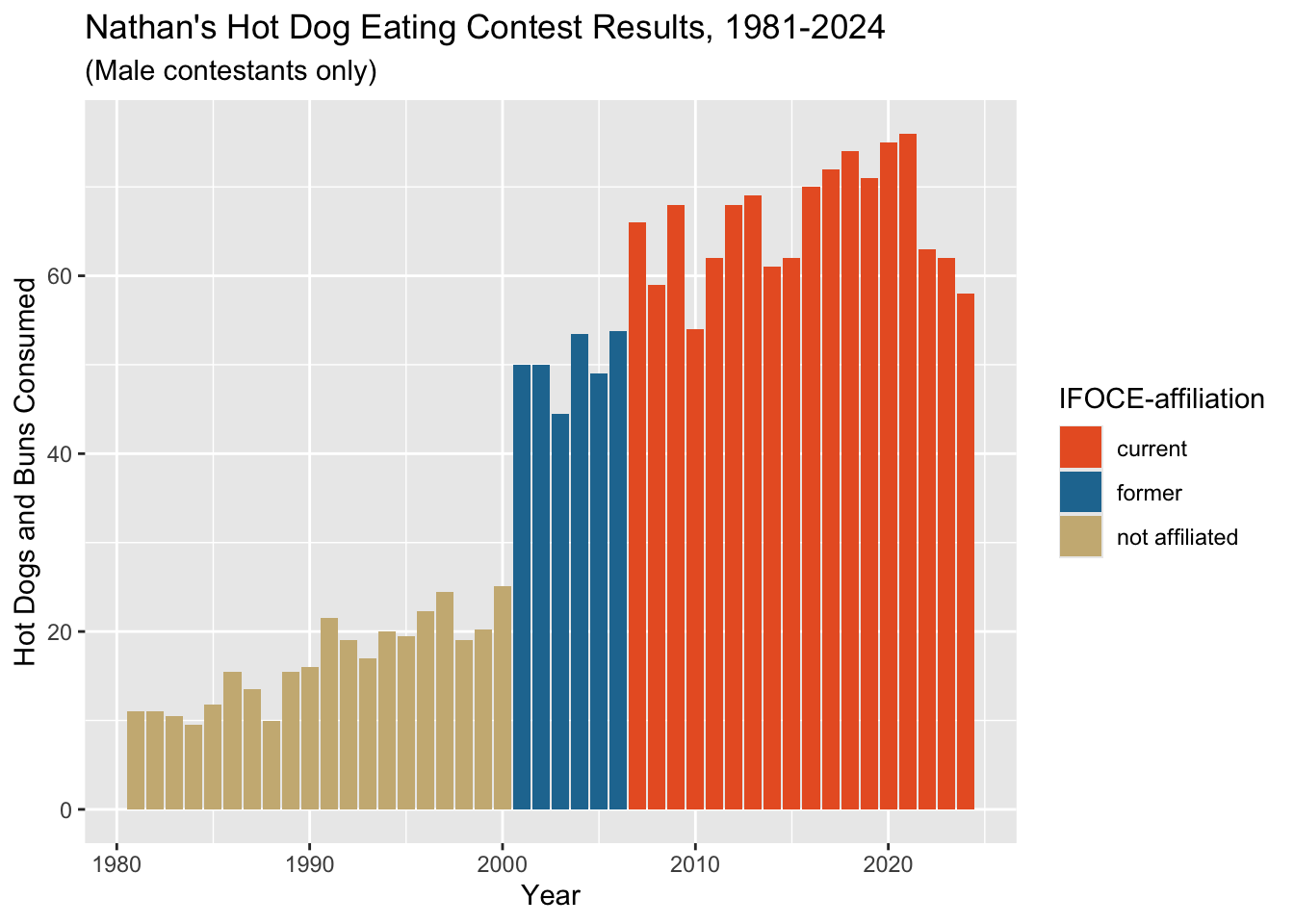
8 Play With Scales & Coordinates
Now that the bones of the plot are in place, it’s time to tweak the details.
The spacing’s a little funky down near the origin of the plot. The documentation
tells us that the defaults are c(0.05, 0) for continuous
variables. The first number is multiplicative and the second is
additive.
The default was that 2.15 ((2024-1981)*.05+0) was added to the right
and left sides of the x-axis as padding, so the effective default limits
were c(1979, 2026).
Let’s tighten that up with the expand property for the
scale_y_continuous (we’ll also change the breaks for y-axis
tick marks here) and scale_x_continuous settings:
affil_plot <- affil_plot +
  scale_y_continuous(expand = c(0, 0),
                     breaks = seq(0, 70, 10)) +
  scale_x_continuous(expand = c(0, 0))
affil_plot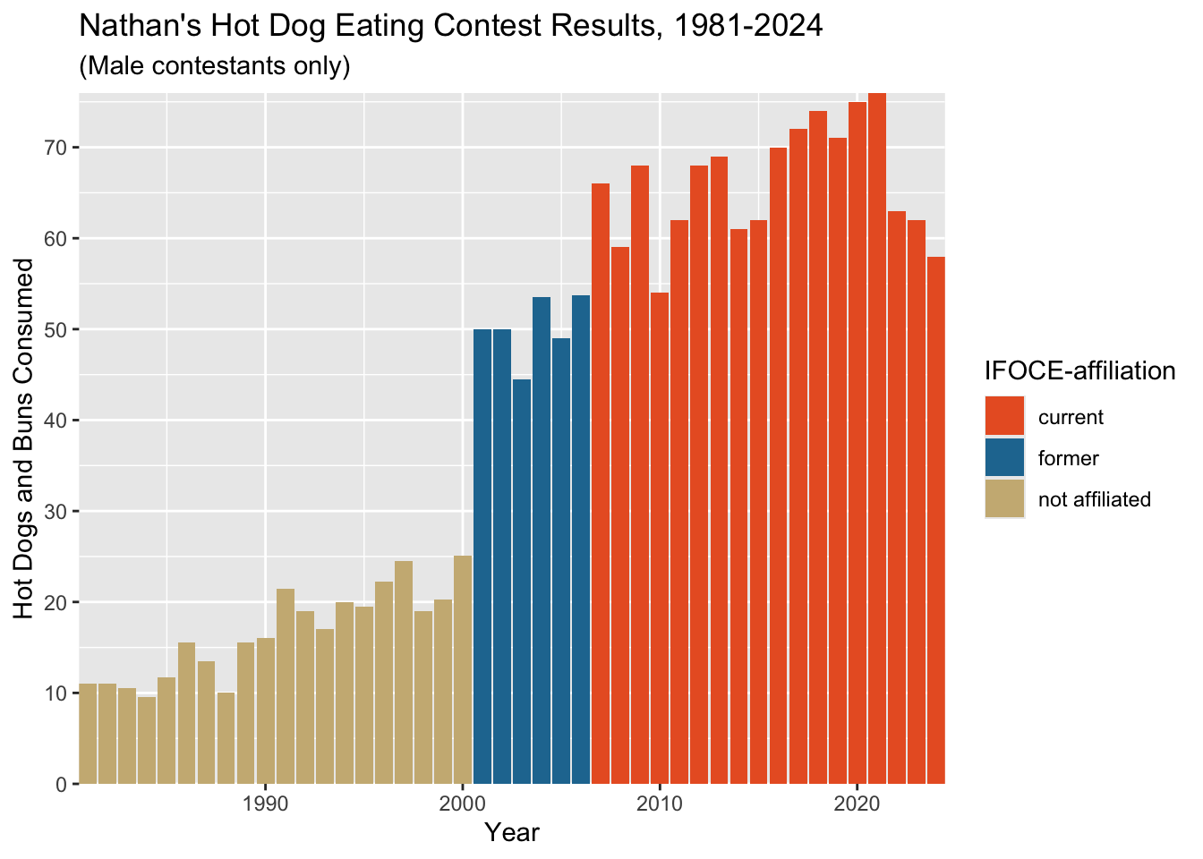
That is perhaps too tight; note the lack of any space between the bars and the y-axis on hte left.
Let’s loosen things up a bit by updating the plot coordinates.
Use coord_cartesian to:
Set the x-axis range to 1980-2024
Set the y-axis range to 0-80
Using coord_cartesian is the preferred layer here
because (from the coord_cartesian documentation): “setting
limits on the coordinate system will zoom the plot (like you’re looking
at it with a magnifying glass), and will not change the underlying data
like setting limits on a scale will.”
In other words, setting limits will actually result in
individual data points being included or excluded from the plot based on
whether they fall within the specified limits, which could have
unanticipated effects (for example, if your plot includes a line fit,
that line fit will be done using only the included data rather than all
of your data).
limits unless you really know what
you are doing! Most of the time, you want to change the coordinates
instead, and do any data point filtering outside of your plotting.
affil_plot <- affil_plot +
  coord_cartesian(xlim = c(1980, 2025), ylim = c(0, 80))
affil_plot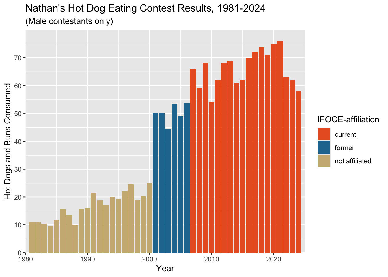
9 Play With Theme Settings
We will talk a lot more about themes and ggplot later in
the term, but for now, the important thing to know is that most visual
aspects of the plot have a name (e.g. plot.title),
and the theme() function lets us tell ggplot
what any named part
of the plot should look like.
Let’s change some key theme settings:
affil_plot +
  theme(plot.title = element_text(hjust = 0.5)) +
  theme(axis.text = element_text(size = 12)) +
  theme(panel.background = element_blank()) +
  theme(axis.line.x = element_line(color = "gray80", linewidth = 0.5)) +
  theme(axis.ticks = element_line(color = "gray80", linewidth = 0.5))
By default, plot titles in ggplot2 are left-aligned. For
hjust:
0== left0.5== centered1== right
We could also save all these as a custom theme. We are not fans of
the default font, so we are also going to change this. To do this, you
need to install the (extrafont package)[https://github.com/wch/extrafont] and follow its setup
instructions before doing this next step.
hot_diggity <- theme(plot.title = element_text(hjust = 0.5),
                     axis.text = element_text(size = 12),
                     panel.background = element_blank(),
                     axis.line.x = element_line(color = "gray80", linewidth = 0.5),
                     axis.ticks = element_line(color = "gray80", linewidth = 0.5),
                     text = element_text(family = "Lato") # need extrafont for this
                     )
affil_plot + hot_diggity 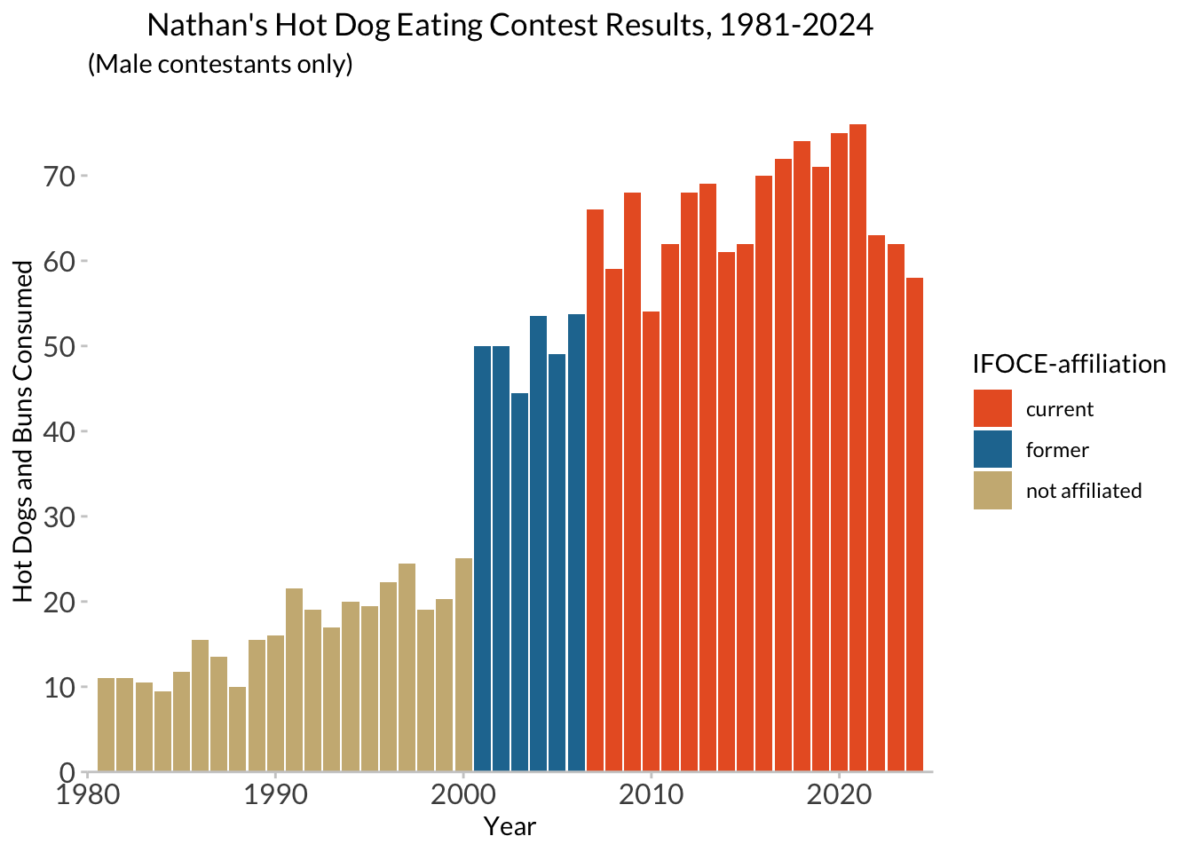
We could also use someone else’s theme:
library(ggthemes)
affil_plot + theme_fivethirtyeight(base_family = "Lato")
affil_plot + theme_tufte( base_family = "Palatino")
The final thing we have to mess with is the x-axis ticks and labels.
We’ll do this in two steps, then override our previous layer
scale_x_continuous.
# manually compute a list of years that we want labeled...
years_to_label <- seq(from = 1981, to = 2024, by = 4)
years_to_label
[1] 1981 1985 1989 1993 1997 2001 2005 2009 2013 2017 2021# add a column to the dataframe containing what we want each year's label to be
hd_years <- hdm_affil %>%
distinct(year) %>%
mutate(year_lab = ifelse(year %in% years_to_label, year, ""))# manually tell ggplot what to use for breaks and labels
affil_plot +
hot_diggity +
scale_x_continuous(expand = c(0, 0),
breaks = hd_years$year,
labels = hd_years$year_lab)Scale for x is already present.
Adding another scale for x, which will replace the existing scale.
10 Final (final, final) version
Don’t name your files “final” :)

All together in one chunk, here is our final (for now) plot! I’m also adding some additional elements here to show you options:
nathan_plot <- ggplot(hdm_affil, aes(x = year, y = num_eaten)) +
  geom_col(aes(fill = affiliated)) +
  labs(x = "Year", y = "Hot Dogs and Buns Consumed") +
  ggtitle("Nathan's Hot Dog Eating Contest Results, 1981-2024", subtitle = "(Male contestants only)") +
  scale_fill_manual(values = c('#E9602B','#2277A0','#CCB683'),
                    name = "IFOCE-affiliation") +
  hot_diggity +
  scale_y_continuous(expand = c(0, 0),
                     breaks = seq(0, 70, 10)) +
  scale_x_continuous(expand = c(0, 0),
                     breaks = hd_years$year,
                     labels = hd_years$year_lab) +
  coord_cartesian(xlim = c(1980, 2025), ylim = c(0, 80))
nathan_plot
The fill legend is doing its job, here, but we might instead want to use direct annotations on the plot itself, to make it easier and faster to read.
ggplot will let us add annotatations to the
plot- i.e., extra text, lines , etc. that are not derived from the data
in the plot, but are manually specified - using the
annotate() function, which adds additional layers to the
plot. The way we are doing it below is a bit tedious, but demonstrates
how it works.
nathan_ann <- nathan_plot +
  guides(fill="none") + # turn off the legend/guide for the "fill" aesthetic
  coord_cartesian(xlim = c(1980, 2025), ylim = c(0, 90)) +
  annotate('segment', x=1980.75, xend=2000.25, y= 30, yend=30, linewidth=0.5, color="#CCB683")+
  annotate('segment', x=1980.75, xend=1980.75, y= 30, yend=28, linewidth=0.5, color="#CCB683") +
  annotate('segment', x=2000.25, xend=2000.25, y= 30, yend=28, linewidth=0.5, color="#CCB683") +
  annotate('segment', x=1990, xend=1990, y= 33, yend=30, linewidth=0.5, color="#CCB683") +
  annotate('text', x=1990, y=36, label="No MLE/IFOCE Affiliation", color="#CCB683", family="Lato", hjust=0.5, size = 3) +


  annotate('segment', x=2000.75, xend=2006.25, y= 58, yend=58, linewidth=0.5, color="#2277A0") +
  annotate('segment', x=2000.75, xend=2000.75, y= 58, yend=56, linewidth=0.5, color="#2277A0") +
  annotate('segment', x=2006.25, xend=2006.25, y= 58, yend=56, linewidth=0.5, color="#2277A0") +
  annotate('segment', x=2003.5, xend=2003.5, y= 61, yend=58, linewidth=0.5, color="#2277A0") +
  annotate('text', x=2003.5, y=65, label="MLE/IFOCE\nFormer Member", color="#2277A0", family="Lato", hjust=0.5, size = 3) +


  annotate('segment', x=2006.75, xend=2024.25, y= 79, yend=79, linewidth=0.5, color="#E9602B") +
  annotate('segment', x=2006.75, xend=2006.75, y= 79, yend=77, linewidth=0.5, color="#E9602B") +
  annotate('segment', x=2024.25, xend=2024.25, y= 79, yend=77, linewidth=0.5, color="#E9602B") +
  annotate('segment', x=2015, xend=2015, y= 82, yend=79, linewidth=0.5, color="#E9602B") +
  annotate('text', x=2015, y=86, label="MLE/IFOCE Current Member", color="#E9602B", family="Lato", hjust=0.5, size = 3)
Coordinate system already present. Adding new coordinate system, which will
replace the existing one.nathan_ann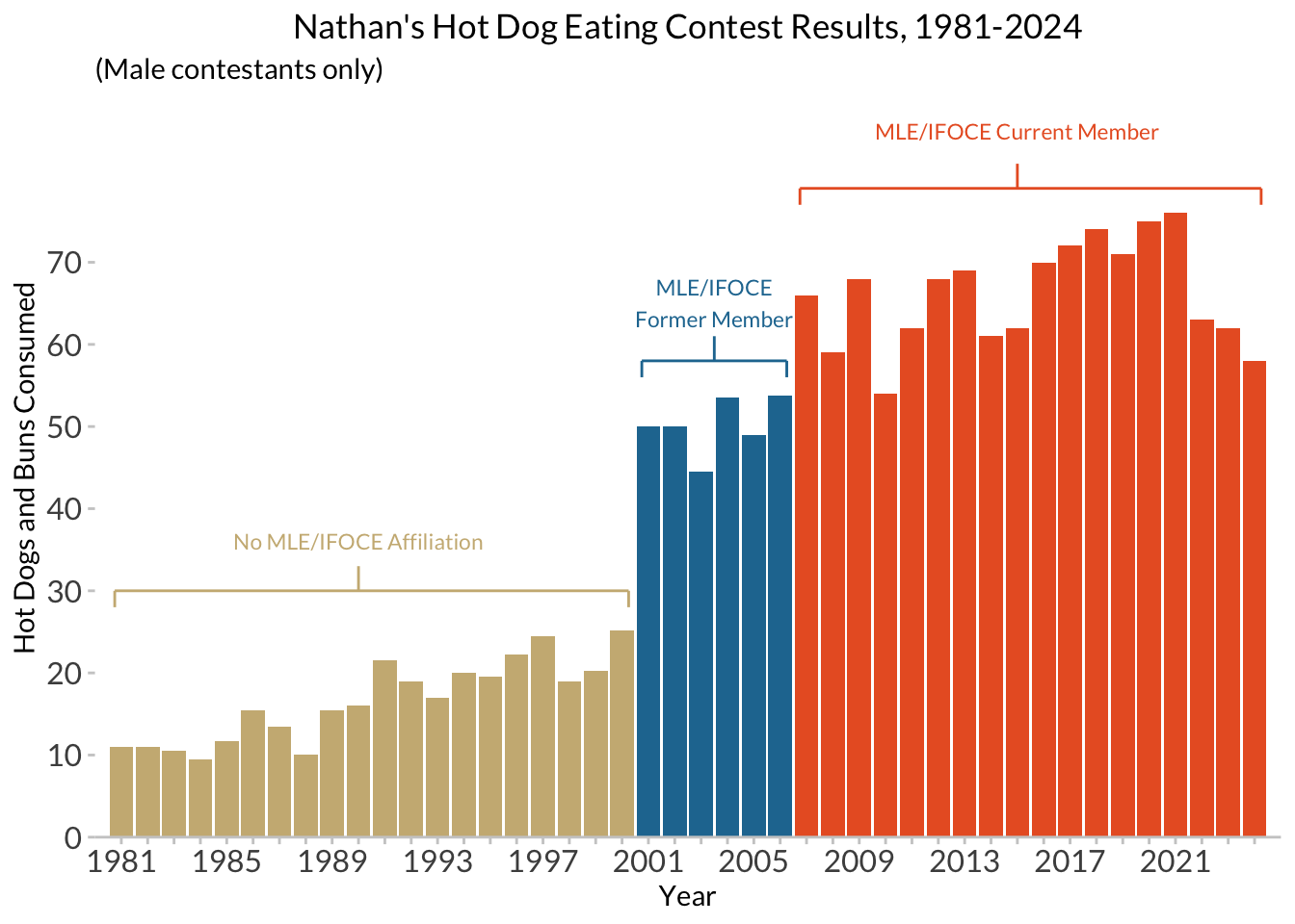
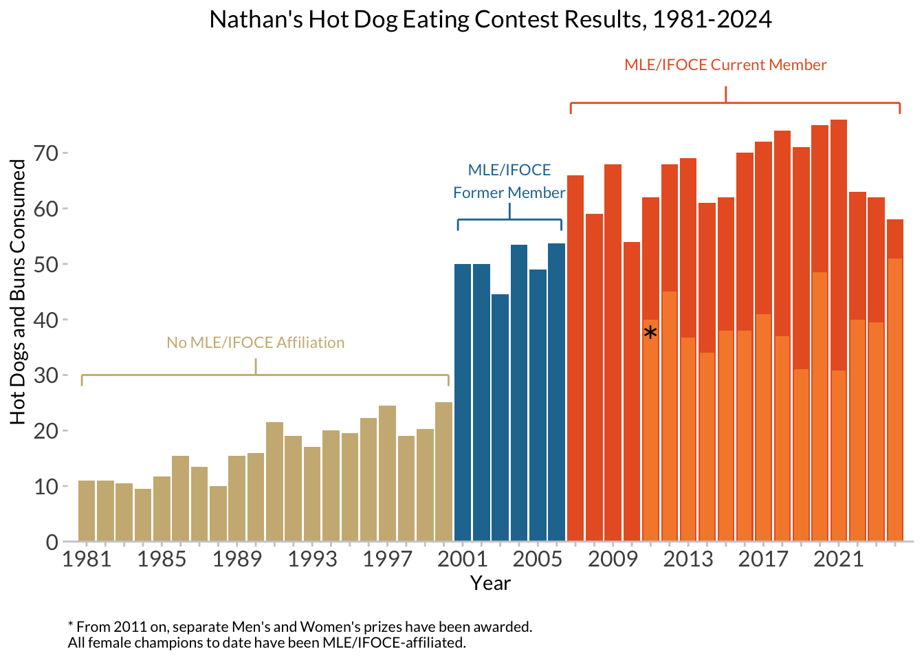
Finally, adding in another layer of data, including information about female contestants:
hdm_females <- read_csv(here::here("data", "hot_dog_contest_with_affiliation.csv"),
    col_types = cols(
      affiliated = col_factor(levels = NULL),
      gender = col_factor(levels = NULL)
      )) %>%
  mutate(post_ifoce = year >= 1997) %>%
  filter(year >= 1981 & gender == "female")
glimpse(hdm_females)
Rows: 14
Columns: 6
$ year <dbl> 2024, 2023, 2022, 2021, 2020, 2019, 2018, 2017, 2016, 2015,…
$ gender <fct> female, female, female, female, female, female, female, fem…
$ name <chr> "Miki Sudo", "Miki Sudo", "Miki Sudo", "Michelle Lesco", "M…
$ num_eaten <dbl> 51.00, 39.50, 40.00, 30.75, 48.50, 31.00, 37.00, 41.00, 38.…
$ affiliated <fct> current, current, current, current, current, current, curre…
$ post_ifoce <lgl> TRUE, TRUE, TRUE, TRUE, TRUE, TRUE, TRUE, TRUE, TRUE, TRUE,…nathan_w_females <- nathan_ann +
# add in the female data, and manually set a fill color
geom_col(data = hdm_females,
width = 0.75,
fill = "#F68A39") +
labs(subtitle = NULL) # no longer need the subtitle warning about male-only data!
nathan_w_females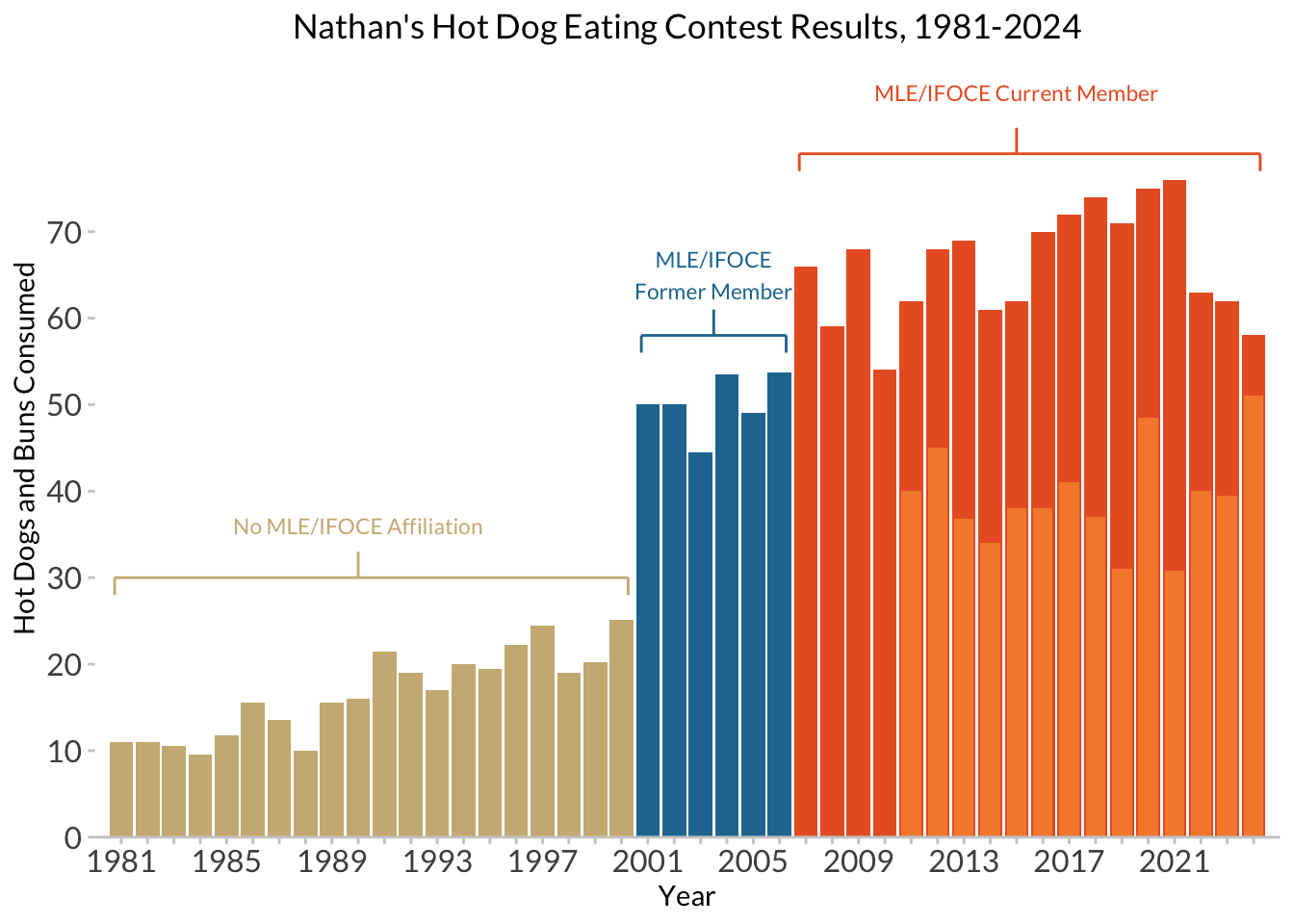
And adding a final caption:
caption <- paste(strwrap("* From 2011 on, separate Men's and Women's prizes have been awarded. All female champions to date have been MLE/IFOCE-affiliated.", 70), collapse="\n")

nathan_w_females +
  # now an asterisk to set off the female scores, and a caption
  annotate('text', x = 2011, y = 36, label="*", family = "Lato", size = 8) +
  labs(caption = caption) +
  theme(plot.caption = element_text(family = "Lato", size=8, hjust=0, margin=margin(t=15)))